

Agricultural News
The Poultry Federation Unveils New Logo
Tue, 02 Nov 2021 12:26:41 CDT
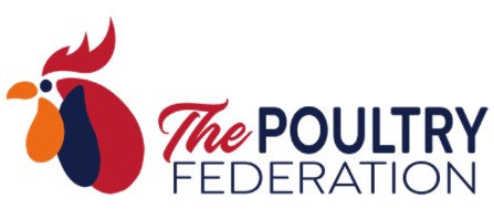 The Poultry Federation (TPF) has a new look. After sixty years, we are releasing an updated brand identity, which includes a new logo, colors, and font.
We believe the new look better matches who we are: a trade organization representing the poultry and egg industry in Arkansas, Missouri and Oklahoma who promotes and protects the interests of the industry and is a unified voice before state governments.
The Federation partnered with Stolz-Mead Global, a full-service promotion agency based in Ohio to help design the new logo.
We embarked on the journey to develop a new logo to help communicate who The Federation is.
In the process of re-branding we wanted our new logo to accomplished the following goals:
· Clearly communicate who we are
· Accurately represent all three states that are a part of The Poultry Federation
· Embody the poultry industry
· Update fonts that can be executed in embroidery and print at a variety of sizes
The new color palette includes red, navy and orange. We currently use this color palette to represent Arkansas (red), Missouri (navy) and Oklahoma (orange). Rather than continue to use black, red and white we wanted to add these colors into the new look as a way of highlighting the states that are a part of The Poultry Federation.
We chose a font that exudes clean, modern, and strong. We are a leader in the industry, and we wanted the text portion of our logo to maintain the strong, professional feel of the original font but with more substance.
We hope you like the new look of The Poultry Federation. We are excited to implement our new logo in our materials as well as on our social media outlets.
WebReadyTM Powered by WireReady® NSI
Top Agricultural News
More Headlines...